How to Turn a Sign Template into Your Own Brand
To make a sign template feel like your brand, change the message and proportions first, then adjust the logo, colors and supporting artwork. Replacing the sample name alone often leaves someone else’s visual priorities in place. Start by deciding what your viewer should notice and do.
A useful starting brief is one sentence: “A visitor should recognize our business and know where to check in.” That brief makes editing easier. Anything competing with those two jobs needs a reason to stay.
Choose a template with the right structure
Look beyond the sample industry. A fitness layout may work for a tutoring service if both need a strong headline, a short explanation and one contact action. A tall welcome board is less useful for a long fence banner because the available space is fundamentally different.
The online Sign Designer offers template search and editing controls for text, shapes, colors, dimensions and layers. Choose the intended product and size early. A template is a starting composition; product availability and finishing still depend on the selected order configuration.
Remove any sample element that you do not need, including decorative badges, secondary offers and placeholder contact details. Do this before enlarging the remaining text. Otherwise, you may spend time fitting a message that should have been deleted.
Give the design a clear reading order
Write three short lines outside the editor: the main message, the supporting explanation and the next action. For example, a fictional plant shop might use “Weekend Plant Market,” “Indoor plants and handmade pots,” and “Inside the courtyard.” This gives each line a different job.
Make the main message visually dominant. Supporting information can be smaller, but it should remain readable in the intended setting. If several details need equal emphasis, consider whether they belong on a separate information sign nearer the viewer.
Keep a business name intact when possible. Avoid shrinking a long name until it resembles fine print. Try a deliberate line break or a template with a wider title area. Read the result without relying on color or an illustration to explain the words.
Worked example: changing a banner’s proportions
Imagine adapting a 72 × 24-inch template to a 60 × 24-inch sign. The original ratio is 72 ÷ 24 = 3, while the new ratio is 60 ÷ 24 = 2.5. Stretching the whole design into the new rectangle would compress horizontal shapes and lettering.
Uniformly reducing the original artwork to 60 inches wide uses a scale factor of 60 ÷ 72 = 5/6. Its height then becomes 24 × 5/6 = 20 inches. That leaves 4 inches of additional vertical space in the new canvas.
Instead of distorting the logo, use that space deliberately: reposition the headline, move the supporting line, or extend a plain background while retaining the artwork’s proportions. These are hypothetical dimensions illustrating layout math, not a requirement to leave a border.
Use your brand assets selectively
Choose one primary brand color, a supporting color if needed and a neutral background or text color. Consistency matters more than matching every decorative color in the original template. Check light text on pale backgrounds and dark lettering over busy artwork at a reduced preview size.
Upload your original logo when available. A photograph or flattened logo image is still one image: adding it to an editor does not make every letter inside it editable. If the logo includes a white rectangle that should disappear, obtain an appropriate transparent version rather than hiding its edges behind more shapes.
Use artwork that represents what you actually offer. Do not keep sample “free,” certification or discount claims because they look attractive. Replace them with verified wording or remove the badge entirely.
Test the result as a sign
Reduce the preview and ask what you notice first. Then inspect the full-size artwork for poor image edges, unintended overlaps and tiny text. Compare the design with the planned mounting or display area, not just the shape of your computer screen.
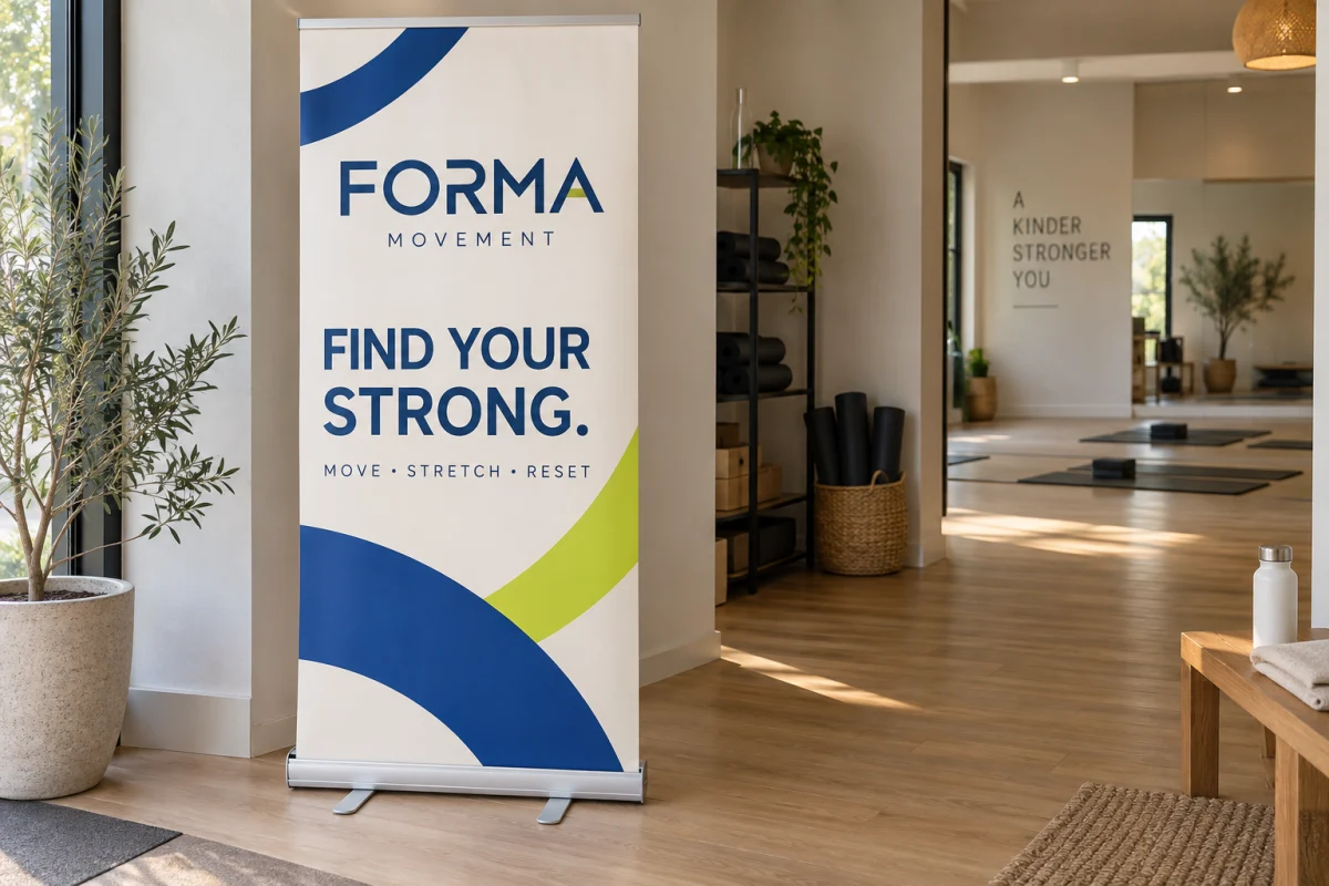
For a tall indoor display, review the actual banner stand product before adapting a template. Its graphic format may differ from a general poster, and important information should be placed with the display hardware in mind.
Save an editable project before downloading the print artwork. Keep an untouched brand template and a separate event-specific copy so tomorrow’s changes do not overwrite today’s approved version. If the design needs a different product or a difficult logo adjustment, get help with the artwork and intended display before ordering.