Retractable Banner Artwork: Keep the Important Message Above the Base
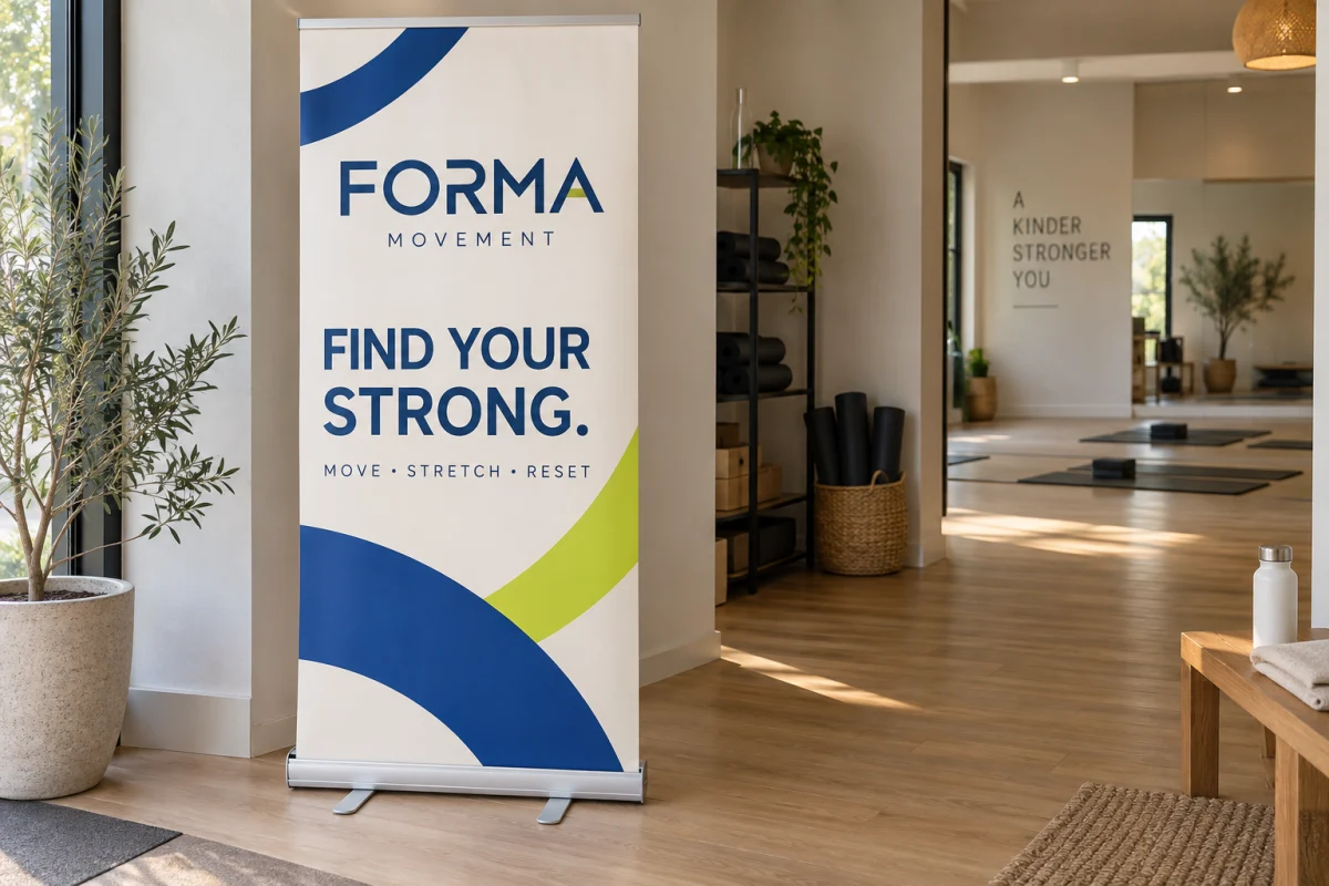
Put the essential message where people can see it on the extended banner, and use the artwork dimensions specified for the actual stand. Do not place a phone number at the bottom just because there is an empty strip in the file. Hardware, a table in front of the display or the viewing angle may hide that area.
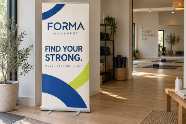
The Get Quick Signs Econo Banner Stand uses a fixed 33.5 × 80-inch, single-sided graphic and includes the base and support hardware. Those dimensions should guide this product’s artwork. They are not a substitute for another stand’s template, even if both products are described as retractable banners.
Confirm what the template dimensions mean
Ask whether the supplied template describes the finished graphic, the visible display area or a production file with additional material for the mechanism. Confirm any insertion area and safe-content guidance before moving the design into place. Do not add a generic extra strip copied from an unrelated supplier.
If you are replacing a graphic in an existing stand, identify the hardware model first. A replacement needs to fit that mechanism, not merely resemble the original from across a room. The Econo complete-unit product should not be assumed to include a replacement-only service for different hardware.
Keep the approved template separate from your customer-facing message. Any guide labels, fold indicators or reference rectangles belong in the working file and proof as appropriate, rather than accidentally becoming part of the printed design.
Build a reading sequence from top to bottom
Start with the one thing a passerby should understand: what you offer, what event is happening or where to go next. Put that message high enough to remain useful when someone stands nearby. The logo can support it without taking over the entire top section.
Use the middle area to explain the message with one photograph, a short supporting line or a focused group of benefits. Put the next action where people can approach and read it comfortably. A detailed service list rarely helps someone decide whether to stop at the booth.
A long vertical shape can tempt you to stack information until every inch is filled. Leave deliberate space between the headline, image and action. That separation gives each part a clear role and makes later changes less likely to force a complete redesign.
A planning example, not a hardware template
For an example 33.5 × 80-inch composition, a designer might sketch a 16-inch headline band, a 40-inch visual band and a 24-inch supporting-information band. The three bands total 80 inches; they represent 20%, 50% and 30% of the height.
These are only organizational proportions. They do not mean all 24 inches of the lower band are safe for essential text. Once the hardware and placement are confirmed, move the call to action above any obscured area and use the lowest portion for nonessential background artwork if appropriate.
As another simple check, a table positioned in front of the stand can hide a message without touching the hardware at all. Make a placement sketch showing the table, extended banner and normal approach direction. Use measured furniture dimensions rather than an assumed standard table height.
Review the display at more than one scale
Check a small overview to judge hierarchy, then inspect text and artwork at the intended print size. A large headline should still look like the headline in the overview. At close range, verify that the website, phone number and any small supporting copy remain clear.
Place a paper strip or simple cardboard mockup in the intended location if practical. Walk toward it from the customer’s approach and stand where a conversation would happen. This tests the information layout and sightlines; it does not establish a guaranteed reading distance or reproduce the printed material.
You can build and revise the layout in the online Sign Designer. Keep the editable version so a changed offer or phone number does not require rebuilding the entire banner from a flattened image.
Approve the message and the placement together
The final proof should identify the stand, graphic dimensions, top orientation and artwork revision. Check the extended-display reference as well as the flat artwork. Make sure important content clears the confirmed hardware zones and the furniture shown in your plan.
If the template, replacement compatibility or visible area is uncertain, send the stand details for confirmation before ordering. A well-positioned headline is valuable only when the finished display lets people see it.