Designing a Window Graphic That Reads from Both Sides
A window graphic that reads from both sides needs two deliberate viewing plans. Decide what someone outside should see, decide what someone inside should see, and approve a normal-reading proof for each direction. Simply duplicating an attractive front design is not enough if its message, orientation or placement makes little sense from the other side.
Get Quick Signs lists DualView window graphics with one-view or double-view options. The double-view product can carry different artwork on its two faces. That makes the glass useful for two audiences, but it also makes clear file labels and paired proofs especially important.
Give each side one job
The outside face often answers an arrival question: What is this business? Is it open? Where is the entrance? The inside face can help someone who is already there: Where do I collect an order? Which counter handles returns? Where can I find the current menu?
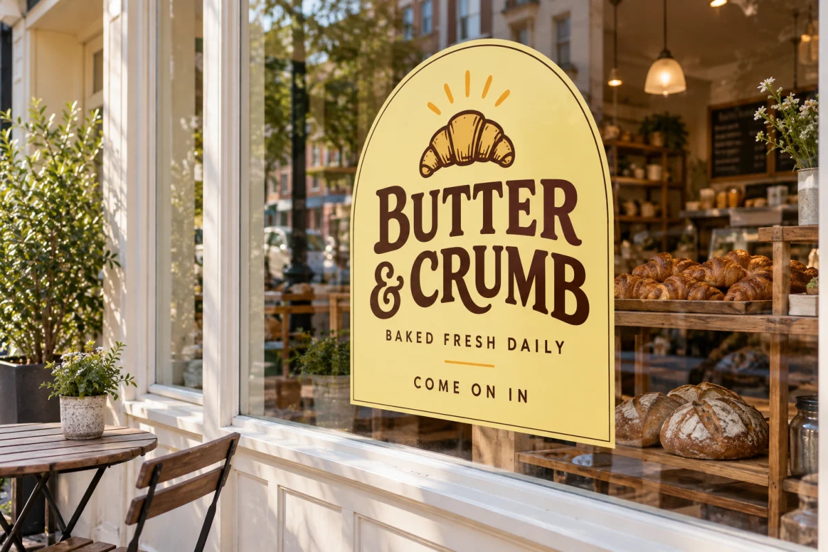
Write those jobs as short sentences before designing. For a hypothetical bakery, the outside brief might be “Identify the bakery and make the opening hours easy to find.” The inside brief might be “Point customers toward pickup.” Those are related messages, but they do not need identical headlines or the same amount of text.
Keep operational or private information off a public-facing design. A two-sided graphic is still displayed in a public setting, and people can approach the glass from unexpected angles. Check whether customers standing in the doorway will see both faces as they move through the entrance.
Label the view, not just the file side
“Front” and “back” become ambiguous when one person means the printed face and another means the side facing the street. Use labels such as “Outside reader view” and “Inside reader view.” Add the window-pane label and dimensions to each proof.
Show the artwork in its intended readable orientation. Leave any production mirroring to the confirmed order workflow rather than flipping a logo yourself and hoping it is correct. A mirrored screenshot may look like a technical instruction even if you intended it only as an installation reference.
- Outside reader view: business name, approved hours and entrance message.
- Inside reader view: pickup instructions and the matching brand treatment.
- Placement reference: a photograph showing the specific pane and intended graphic position.
Use dimensions to compare the layouts
Consider an example 24 × 36-inch graphic. Suppose the outside version reserves the top 10 inches for the name and logo, the next 18 inches for its main message, and the bottom 8 inches for hours. The heights add to 36 inches. This is a content-allocation sketch, not a bleed or safe-area specification.
The inside version might use the same top 10-inch brand area, a 12-inch pickup message, and 14 inches of supporting space. Again, 10 + 12 + 14 = 36. The matching brand position connects the two faces visually, while the different message areas let each serve its audience. Actual text must still fit comfortably within the product’s confirmed printable and visible areas.
Print small paper versions of both layouts and place them back to back. This will not simulate the film’s finish or opacity, but it is a useful way to catch an upside-down arrow, inconsistent brand placement or a message facing the wrong audience.
Approve two views and one physical placement
Review the outside and inside proofs together. Check spelling, hours, phone numbers and directional words on each. Confirm whether an arrow refers to the viewer’s left or the building’s left. “Pickup to your right” must be tested from the actual place where the customer will read it.
Then inspect the placement photograph. Door handles, frames and existing signs may interrupt a clear design. If the two faces share a logo location, verify that both remain clear of those obstacles. Do not assume a printed mockup proves the material’s transparency or nighttime behavior.
Keep the final handoff unambiguous
Save a matched pair with the same revision number, for example “Pane-B-outside-v03” and “Pane-B-inside-v03.” Retire earlier versions from the order folder so the printer is not left choosing among nearly identical files. Keep an editable copy in the Sign Designer workflow if that is where you created the layout.
Send the paired artwork, pane dimensions and application-side notes together. If either orientation is uncertain, ask for confirmation through the project contact form before approving production. The goal is a window that communicates correctly from both approaches, not merely a file with two pages.