How Big Should Sign Letters Be to Read from the Road?
The working rule is 1 inch of letter height for every 10 feet of viewing distance. That guideline comes from legibility research by the United States Sign Council with the Pennsylvania Transportation Institute at Penn State, and it is the single most useful number in sign design. A sign meant to be read from 100 feet needs 10 inch letters. The catch drivers, speed: at 45 miles per hour a car covers 66 feet every second, so the real question is not how far your sign can be seen but how many seconds of reading time your letter height buys.
Key takeaways
- United States Sign Council research supports roughly 1 inch of letter height per 10 feet of distance for best impact legibility.
- Readable and visible are different: a sign can be noticed far beyond the distance at which its words resolve.
- Speed converts distance into time. At 30 miles per hour a driver covers 44 feet per second; at 60, 88 feet per second.
- Contrast, font weight and letter spacing can stretch or destroy the rule. High contrast simple fonts read farthest.
- Design for the fastest realistic viewer, not the pedestrian standing at your door.
How far does each letter height read?
| Letter height | Best impact distance | Reading time at 30 mph | Reading time at 45 mph |
|---|---|---|---|
| 3 inches | 30 feet | under 1 second | under 0.5 seconds |
| 6 inches | 60 feet | about 1.4 seconds | about 0.9 seconds |
| 10 inches | 100 feet | about 2.3 seconds | about 1.5 seconds |
| 18 inches | 180 feet | about 4 seconds | about 2.7 seconds |
| 24 inches | 240 feet | about 5.5 seconds | about 3.6 seconds |
Reading time here is the window between the word first resolving and the car passing the sign, using 44 feet per second at 30 miles per hour and 66 at 45. A driver also needs attention to spare for the road, which is why the United States Sign Council guidance effectively builds in reaction margins for detection, reading and response.
What does this mean for common sign types?
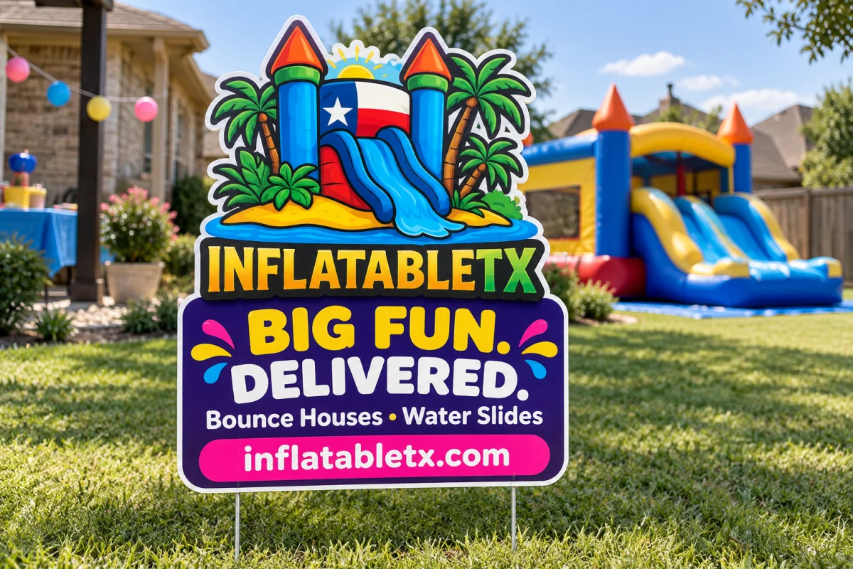
- Yard signs: an 18×24 holds 3 to 4 inch headline letters, best within about 40 feet, which suits residential streets. Faster roads want 24×36, compared in our yard sign size guide.
- Banners: a 3×6 foot banner comfortably carries 12 inch letters on one line, readable around 120 feet. Sizing scenarios are in the banner size guide.
- Building signs: dimensional letters and panels should size to the main approach road, worked through in what size business sign do you need.
Which design choices stretch legibility?
- Contrast first. Black on white or yellow, white on dark blue or red. Low contrast pairings can halve effective distance.
- Simple, bold fonts. Clean sans serifs with generous letterforms outperform scripts and condensed faces at distance.
- Letter spacing. Slightly opened tracking keeps letters from merging at long range.
- Fewer words. A driver at speed processes 3 to 5 words reliably. Name, trade, phone number.
- Case matters. Mixed case or all caps in short bursts both work; long all caps sentences read slower.
How do you apply the rule in practice?
Stand where your customer first sees the sign, measure or pace the distance, divide by 10, and that is the minimum headline letter height in inches. Then check the sign face can physically hold it: a 10 inch letter line with margins needs a face at least 16 to 18 inches tall for one line of text. If the math forces a bigger sign than the space allows, cut words instead of shrinking letters. Phone numbers deserve special attention; if you expect drivers to dial, keep the number at least half your headline height, or move that job to a QR code where the context suits scanning.
Test your layout before printing
Mock the design in the free Sign Designer, print the headline on office paper at actual size, tape it up and walk back the target distance. It is a 5 minute test that prevents the most common sign mistake we see: beautiful artwork with letters half the needed height. When the layout passes, order through any product page, from coroplast signs to vinyl banners, with free artwork checks, typical production of 1–3 business days after artwork approval on most items and delivery options confirmed in the cart. Browse all materials in the shop.
Frequently asked questions
What is the 1 inch per 10 feet rule?
A legibility guideline supported by United States Sign Council research: each inch of letter height gives about 10 feet of comfortable reading distance under good conditions.
How tall should letters be for a road with 45 mph traffic?
Work backward from time. To give a driver 2 to 3 seconds of reading at 66 feet per second, letters need to resolve from roughly 150 to 200 feet, meaning 15 to 20 inch headline letters.
Does font choice change reading distance?
Yes. Bold, simple, well spaced fonts at high contrast reach their full rated distance. Scripts, condensed faces and low contrast colors fall meaningfully short.
Is bigger always better for sign letters?
Up to the point where margins and word count suffer. A sign crammed edge to edge with huge text loses the white space that makes it readable, so cut words before shrinking letters.